FAIRFAX COUNTY TIMES MAY 7, 2009
Greater than the sum of its parts
Award-winning two-level addition redefines a home’s facade
By John Byro
Changes were imminent when Mike Martin bought his two-story contemporary on five acres’ in Great Falls nearly 20 years ago. The house had many features that won his heart and an enviable location. But some of the bedrooms in the 5,400-square-foot home were too small; so, too, were the closets and master bath. And, above all, the house itself lacked the much-desired “curb appeal.”
After a few years of occupancy, Martin decided to uild a two-level addition. The homeowner followed proffered advice to a T, but not long after the addition was completed, Martin’s old misgivings recurred. The 600-square-foot wing hadn’t improved the situation.
“Essentially, the contractor created ah addition in a contemporary wood-clad style, which he attached to the original nondescript brick box,” Martin said. “The problem was the front door faced west, and the street view is from the south. Ascending the drive, you were looking at a side elevation that simply had no cohesive style.”
Moreover, Martin still hadn’t gotten the family-use program he wanted, which now included a dramatic entrance and foyer, an upgraded kitchen, a home office, a larger master bath, an upstairs laundry, a large guest suite, a two-car garage and substantial interior upgrades.
Reflecting on long-forestalled plans to shift the home’s front elevation, Martin acknowledges that his unsatisfactory experience made him wary. As his ideas for a second addition developed, in fact, he solicited feedback from both an architect and a builder, yet took no action.
“1 had stockpiled a lot of ideas, but I was intent on finding professionals … who would allow me to be in the middle of things,” he said.
It was at this juncture that he learned about Michael Nash Kitchens and Homes.
“They proposed a conceptual outline that nailed down the cost range, yet allowed me to make transparent line-item decisions as the project moved forward,” he said.
Finding their footing
Martin’s list of new and enlarged rooms called for a 2,000-square-foot addition, which he wanted to site on the existing structure’s south side as a component in the home’s new facade.
Complications showed up early. While previous studies had’suggested that the addition would require a three- to four-foot foundation, as the project matured, Fairfax County determined that the proposed depth was inadequate. In fact, the excavation eventually reached 15 feet below grade — a significant increase in required operation costs.“None of us expected the soils compaction problem,” Martin said.
Further studies revealed the need to firm up the grade on the structure’s south side to accommodate a new driveway. A well had to be relocated from the front of the house to the rear. Structural supports and changes to utility lines were required.
The art of the facade
Beyond site planning, the proposed addition’s foremost consideration was architectural: how to present the home’s new multilevel block within a balanced and well-articulated new facade. Out of the gate, Shawn Nazemian, designer at Michael Nash, proposed changing the old addition’s cladding from wood to brick. Martin had envisioned a front entrance tower as the facade’s defining component; Nazemian suggested introducing blue quarry stone that had been used in the earlier addition to vary the color scheme. Stone, thus, became the defining feature of both the tower and an architecturally sympathetic stairway further down the slope.
Nazemian also designed the new facade’s roof slopes, recommending that the symmetry would be improved by bringing the tower forward. This led to a decision to incorporate two porches with pillars on either side of the tower as a unifying element.
Independent architects who have assessed the recent Contractor of the Year award finalist extol the new facade since it scales down the mass of the new front elevation, preventing it from seeming too monolithic.
“The idea is to give a viewer inter
esting, architecturally varied components,’
Nazemian said. ‘The eye lingers because there are compelling constituent parts’ within a balanced whole.”
Since the redesigned facade necessarily impacted the interior design, assigning alternate purposes to old walls inspired a whole series of innovative solutions.
The former west-facing brick wall, for instance, was incorporated into a spacious foyer that unfolds as a procession as one enters the new front door under the central tower. Referencing the brick’s textures, the foyer flooring consists of multi-hued flagstone panels. The large Palladian window in the tower at the entrance invites natural light and draws the eye upwards. At the opposite end of the corridor, a museum-sized piece of Indonesian driftwood draws attention forward.Recessed lights and periodic objects d’arte complete the appealing gallery-like ambiance. To the left, through a pair of doors, one enters Martin’s home office and library; on the right, the old front door and double-hung windows have been converted intogenerous archways accessing, respectively, the living room and a hallway that leads back to the dining room and new kitchen. A west-facing two-car garage (behind the office) is accessible through a door that parallels the archway. The addition’s second floor accommodates a guest suite, the laundry and a substantially enlarged master bathroom suite.
“Overall, the addition is a seamless complement to the old house, with a very functional first-level floorplan,” Martin said.
Reconfigured and upgraded
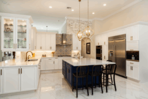
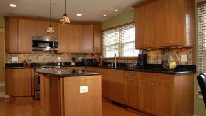
If the addition accommodates activities that previously had no dedicated rooms, it’s the clever reconfiguration of existing space that lifts the house into the realm of luxury living. Co-opting a portion of the new addition, the Michael Nash plan allocates 270 square feet for a master bathroom suite immediately adjacent to the existing owner’s quarters while converting the form quickly,” Martin said. The new gourmet kitchen is finished in an elegant Craftsman-style interior. Dark cherry cabinet facings in conjunction with Brazilian Verde Marinace marble surfaces lend tonal and textural contrast. Diagonally arranged mosaic backsplashes, interspersed with copper tiles embossed with a floral motif, add visual rhythm.er bathroom to walk-in closets.
Fundamentally, the master bathroom is a luxury spa in every sense. A whirlpool bath on a raised ceramic dais is neatly tucked under a front window. A large glass shower complete with L-shaped Tuscan marble seats provides a perfect chamber for relaxing after a steamy bath. Marbleized porcelain floor tiling in diagonal patterns emphasizes the room’s spaciousness while conferring unity.
A dual-purpose island provides a cook’s sink, dishwasher and food preparation area while a slightly lower lunch counter spares diners a too-close view of the clean-up.
In all, a pleasant place to call home.
Michael Nash Design Build & Homes is a world class, multi-awarded, best of the best home remodeling company which specializes in Complete Kitchen Remodeling, Complete Bathroom Remodeling, Complete Basement Remodeling, and Complete Home Additions & Extensions. Our expertise also extends to Addition Remodeling as well as Major Renovations, New Custom Homes, Outdoor Living Services and Green Remodeling. For inquiries and in-home consultations, call us on our mobile number (703) 457-8684 or email us at info@michael-nash.com. You can also take advantage of our services through these areas: Northern VA | Aldie | Alexandria | Annandale | Arlington County | Arlington | Ashburn | Burke | Centreville | Chantilly | Clifton | Dunn Loring | Fairfax County | Fairfax Station | Fairfax | Falls Church | Gainesville | Great Falls | Haymarket | Herndon | Leesburg | Lorton | Loudoun County | Manassas | McLean | Merrifield | Oakton | Potomac Falls | Prince William County | Purcellville | Reston | Springfield | Sterling | Vienna | Woodbridge, VA.

