MICHAEL NASH KITCHEN REVISIONS MEET BUSY OAKTON FAMILY’S CHALLENGING REQUIREMENTS
Master Designer Sonny Nazemian reveals practices that are making local kitchens more spacious, attractive and comfortable
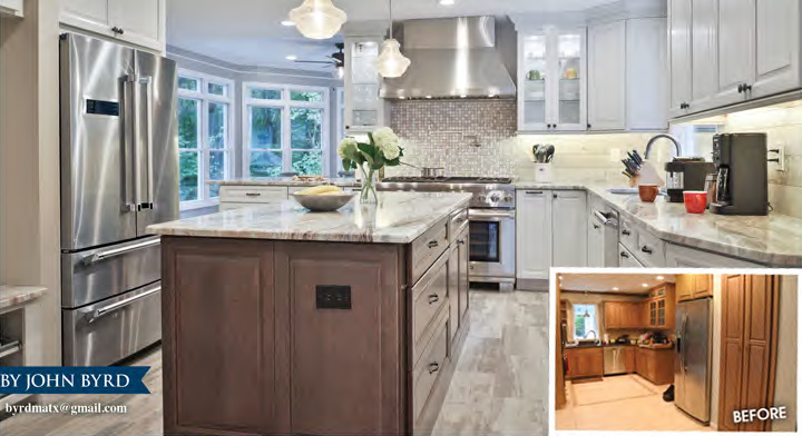
To better rationalize the space-restricted floorplan of a 30 year old Oakton kitchen, designers at Michael Nash Kitchens and Homes deleted both a garage-access mudroom and a butler’s pantry, generating 72 square feet of new floor space and converting a cramped galley into a spacious gourmet affair handsomely situated in the heart of the house.
The solution establishes a stronger visual connection between the expanded kitchen and the formal dining room, but– more importantly– allocates space for a 3’ x 5’ food prep island and dining counter convenient to the dining room, refurbished breakfast room and family room with hearth.
To accommodate for the lost mudroom, the team introduced four personal storage cubbies along a beadboard-clad wall opposite the entrance from the garage and next to the relocated refrigerator.
BEFORE:
The original circa-1990s galley kitchen was designed almost exclusively for cooking and clean-up. Ceiling-flush HVAC venting limited cabinet size to 30 inches.
AFTER:
By incorporating square footage formerly deployed for a butler’s pantry and a garage-access mudroom, Michael Nash extended the existing kitchen 72 square feet generating floor space needed for a 3′ x 5′ food prep island and dining counter. Cabinets have been extended to the ceiling resulting in a 20% increae in storage capacity.
“This is a family-friendly plan,” says Sonny Nazemian, founder and president of Michael Nash Kitchens and Homes.
“The first-level room configuration incorporates three well-conceived satellite gathering areas, but family needs called for a larger, more functional kitchen with stronger relationship to socializing zones in all directions.”
“Because the house also backs into a beautiful woodland it made sense to facilitate indoor outdoor circulation by removing some walls that obstructed sightlines,” he adds.
From the start, improved kitchen functionality meant more intelligently designed work triangles, a state-of-art cook top range, an increase in storage capacity, and serving stations positioned to support the breakfast room, the dining room, and a family room. The “open plan” emphasizes visual linkage between rooms and makes a more sensible use of decking off the breakfast room.
To augment storage, Nazemian and team removed the ceiling flush HVAC system and replaced the standard 30” cabinets with 42” variants; glass-facing cabinets have been custom-designed to display specific stemware and china. There are special drawers for preferred spices, sauce pans and certain cooking implements.
AFTER:
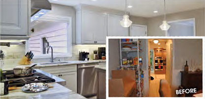
The new plan provides direct access to the formal dining room (arch upper right) and garage (small white door). The two-seat dining counter is a convenient place for kids with homework to catch-up with Mom while meal prep is underway. To increase natural light availability, the design team installed a 33′ window above the sink.
BEFORE:
Kitchen view from dining room. Eliminating a corridor that included a butler’s pantry (left) and mudroom(right) generated critical kitchen floor space.
“A decade back, there was less concern for optimizing a kitchen’s floorplan,” the remodeler observes. “Since then we’ve learned that rerouting HVAC concealed in bulk heads can create the vital wall surfaces needed for taller cabinets. The change can result in a 20% increase in kitchen storage capacity– which also means less clutter and surfaces that are better integrated into actual food prep.”
The existing builder-grade stove has been replaced with a six burner cooktop and professional caliber ventilating hood. There is now a pot filler above the range. The eye-catching backsplash has been articulated in multi-color mosaic tiling that resonates within the softer palette employed for wall surfaces, flooring and cabinet facings.
Taken as a whole, the re made interior design offers a profound contrast from the earlier cedar-clad kitchen which the owners had come to regard as too dark.
After consideration of several options, designers pointed out that the generously light-filled former breakfast room provided an appropriate model for an interior scheme that would stress softer muted tones, wood grain flooring and lightly textured surfaces.”
“We were looking for a balance of elements suitable to the scale of a larger kitchen situated in the middle of everything,” Nazemian explains. “The lighter surfaces work well in a space that features wooded views, and a lot of sunlight.”
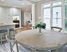
Breakfast Room
The generously light-filled former breakfast room inspired an interior design scheme that stresses softer muted tones.
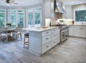
Breakfast Room:
Well-positioned serving stations facilitate an easy circulation pattern perfect for entertaining.
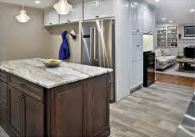
Access to Family Room with Hearth
A wine refrigerator is situated midway between the kitchen and the family room.


