Kitchen 113 Gallery


Kitchen 113 Gallery
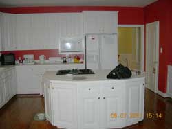
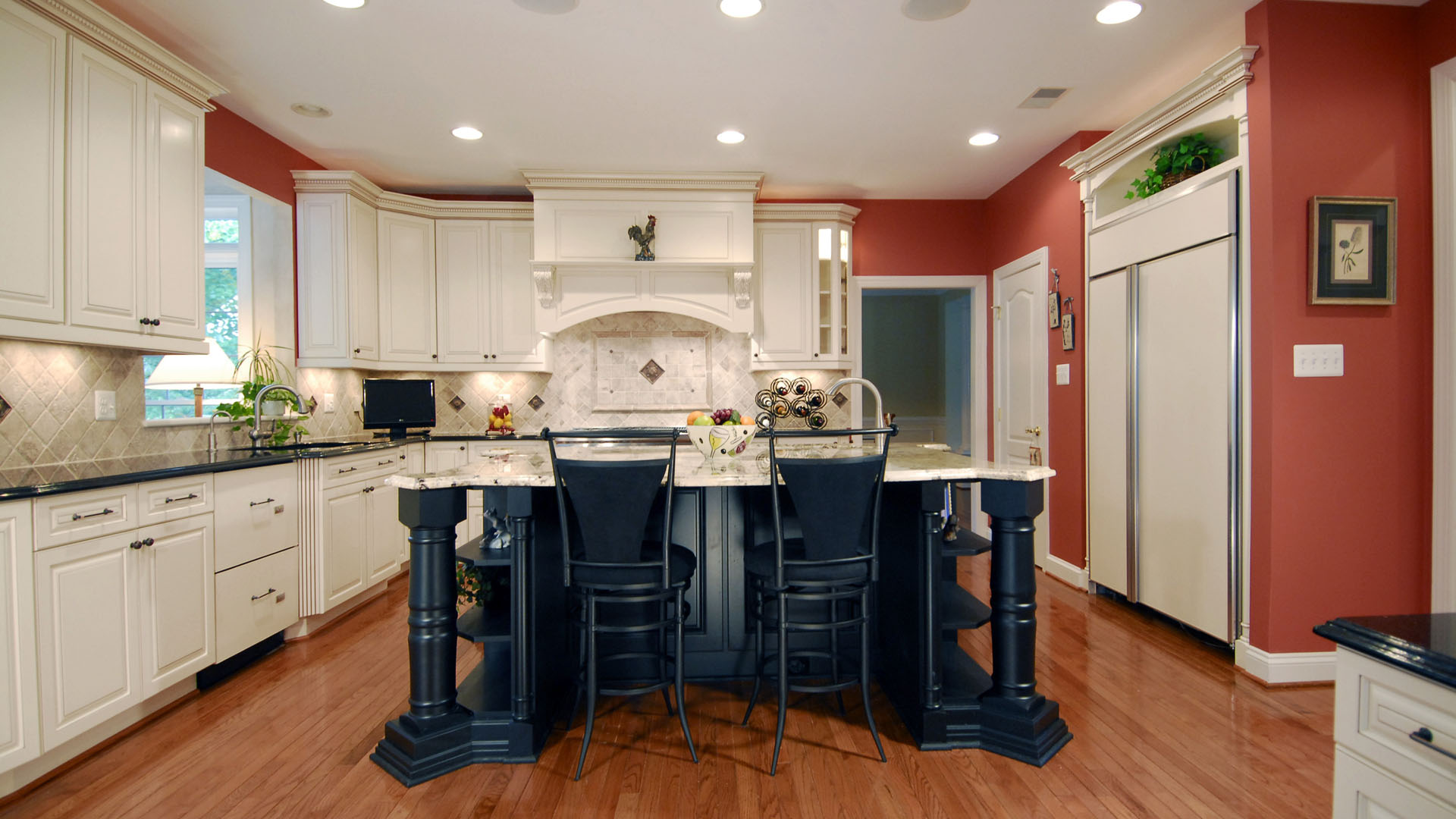
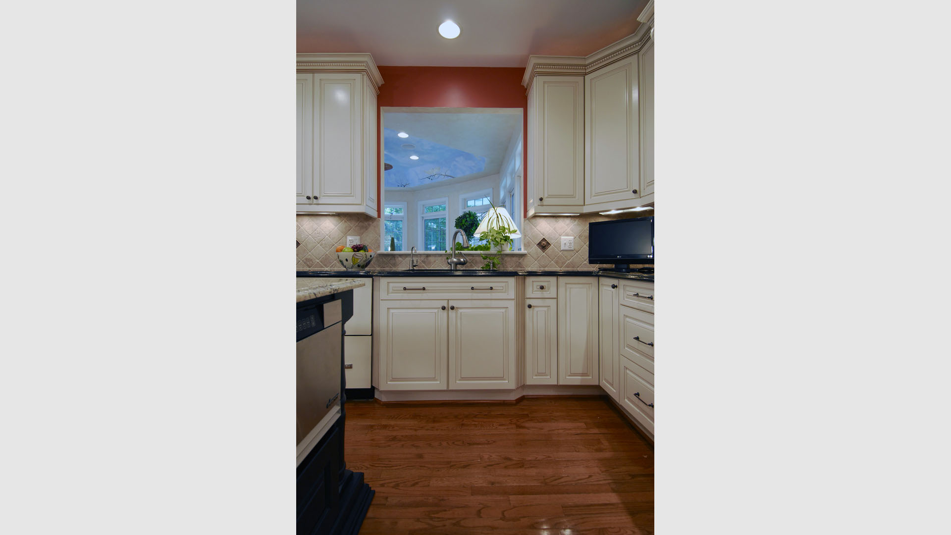
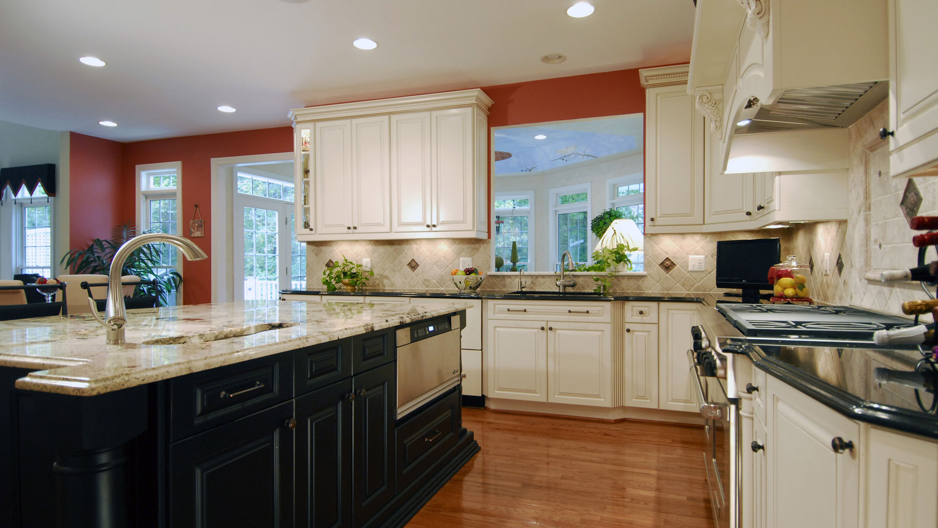
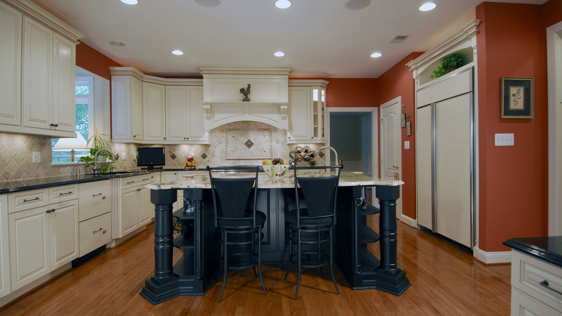
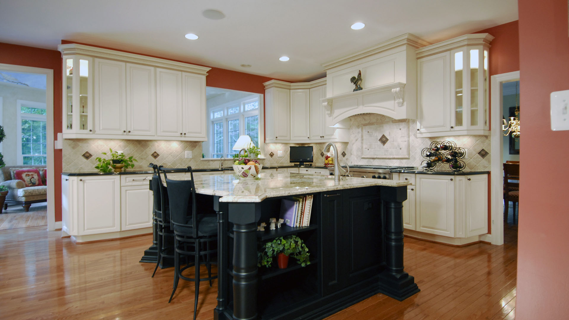
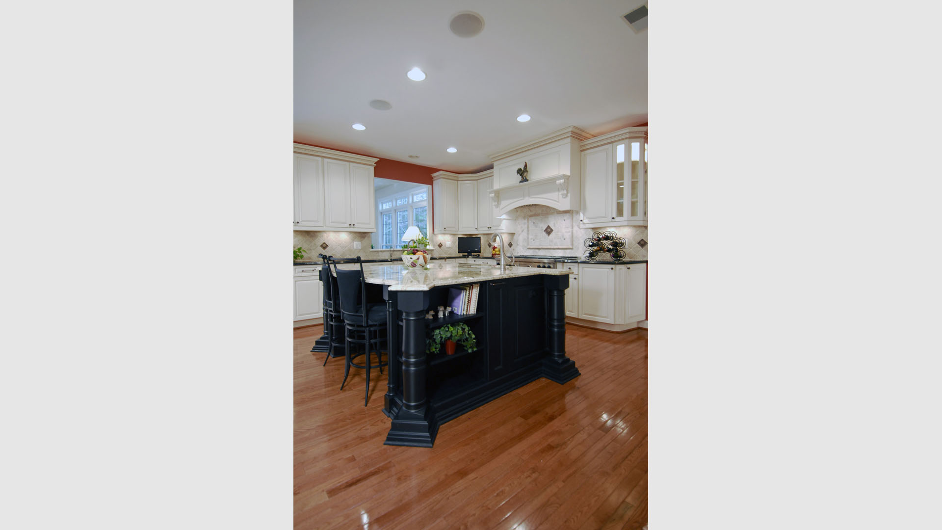
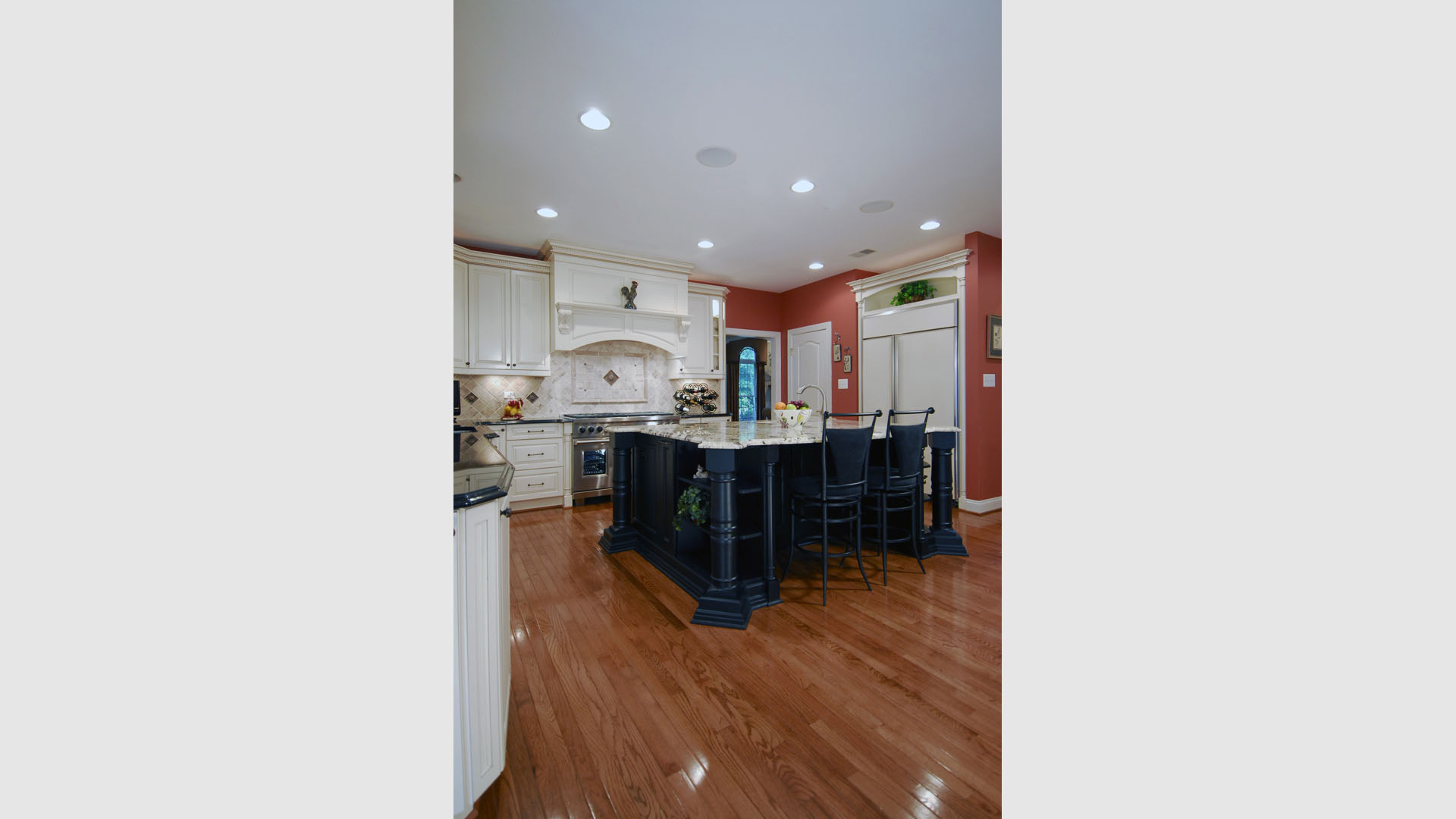
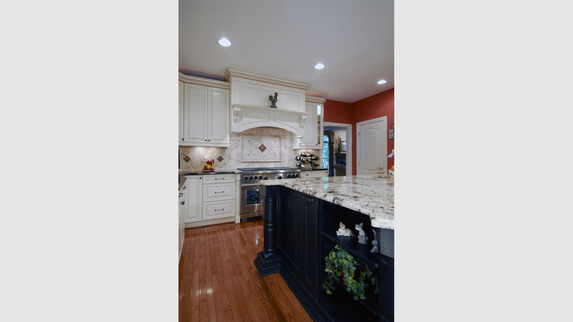
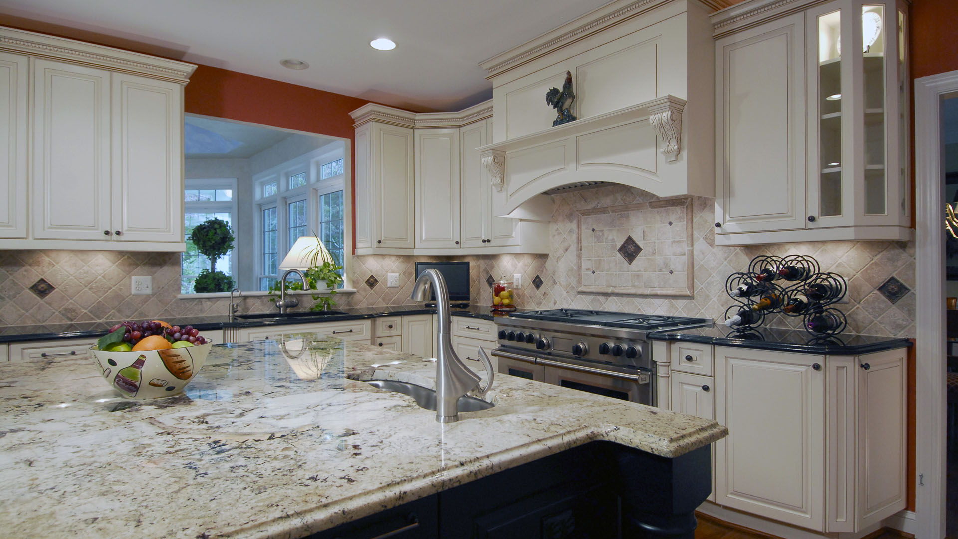
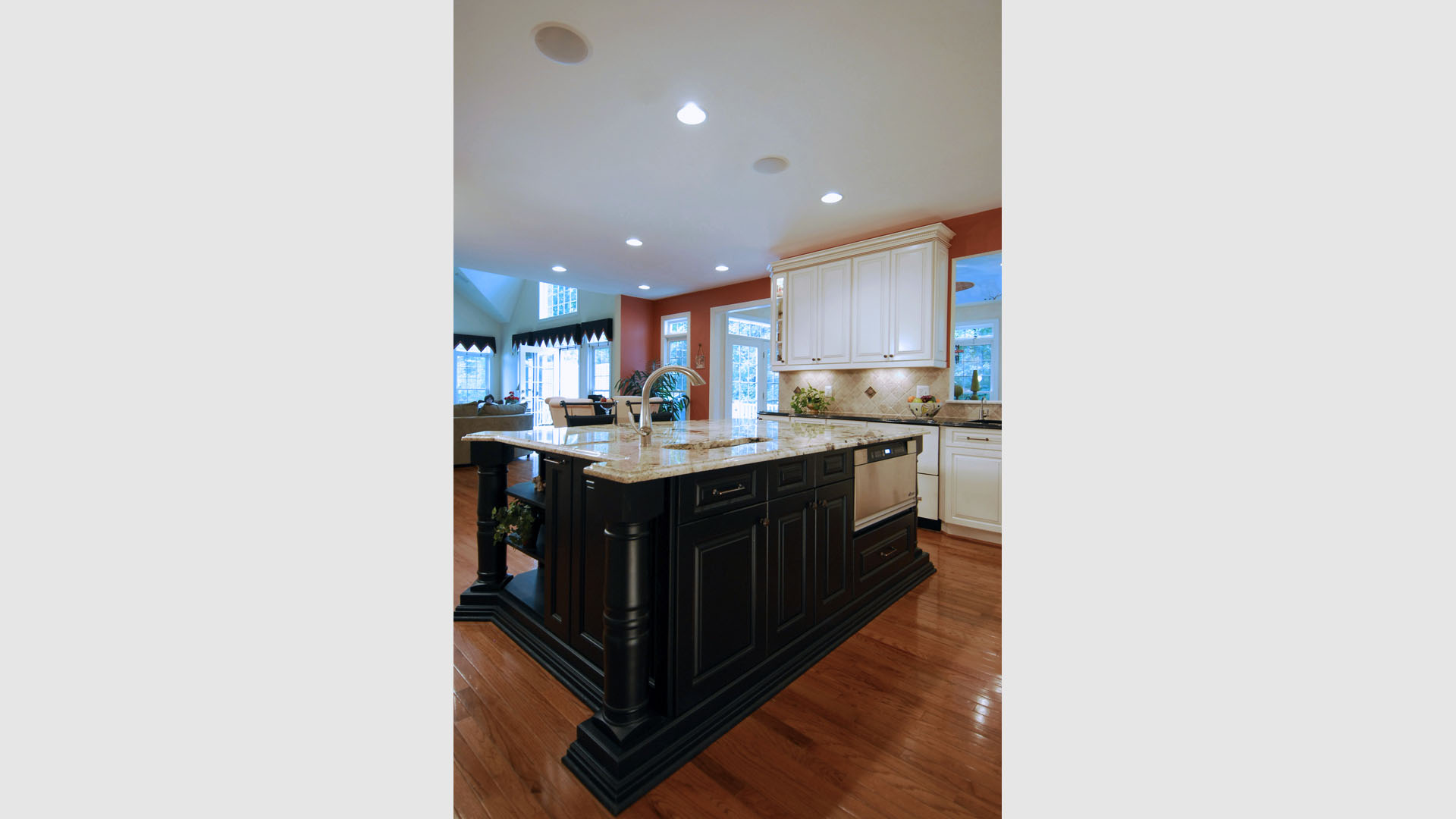
In this relatively new large home, the kitchen was all white cheap cabinetry. The homeowners tried to dress it up with the bright wall color, but what it really needed was a substantial upgrade. The white cabinets were too bright, but the homeowners still wanted a bright kitchen, just not gaudy. They also wanted some contrast to create interest, and they wanted some traditional details. We created the espresso island to contrast with the ivory cabinets, and designed the curved sink and notched granite top and turned legs to make it special. We used glass door cabinets on the ends to break up the expanse of solid wood, and an ornamental range hood to compliment the styling on the island. The cooktop is a professional gas range. The backsplash tiles are tumbled travertine, to add some texture, and there are metallic accent tiles throughout for interest as well. We put the microwave in the island near the cooktop, and bookshelves around the other sides. All appliances have paneled fronts to match the cabinetry. The pantry closet has shelving with rope detail to upgrade it as well.

 before and after