2011 NARI Capital CotY Grand Award Winner


2011 NARI Capital CotY Grand Award Winner
Owners had just purchased this new home in the neighborhood. They have already had their entire old home done by our firm and now wanted to do the same with this new home.
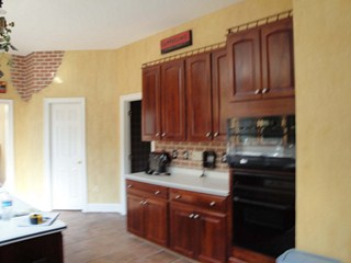
She did not like the disconnection between kitchen and breakfast area. The falling apart garden window over the sink was not attractive and was making their home look a lot older. The cabinetry was dark and spread around with no rhyme or rhythm.
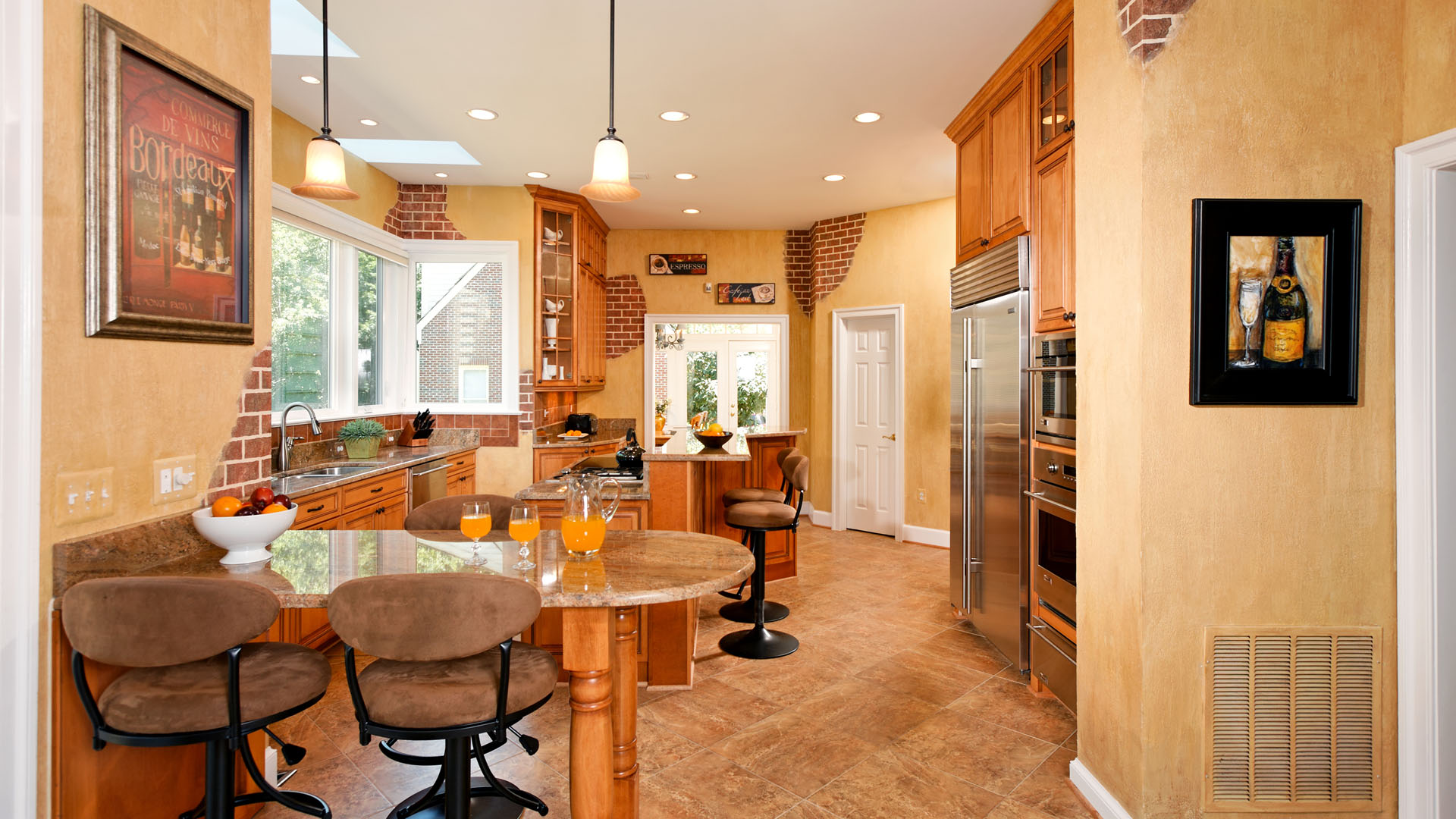
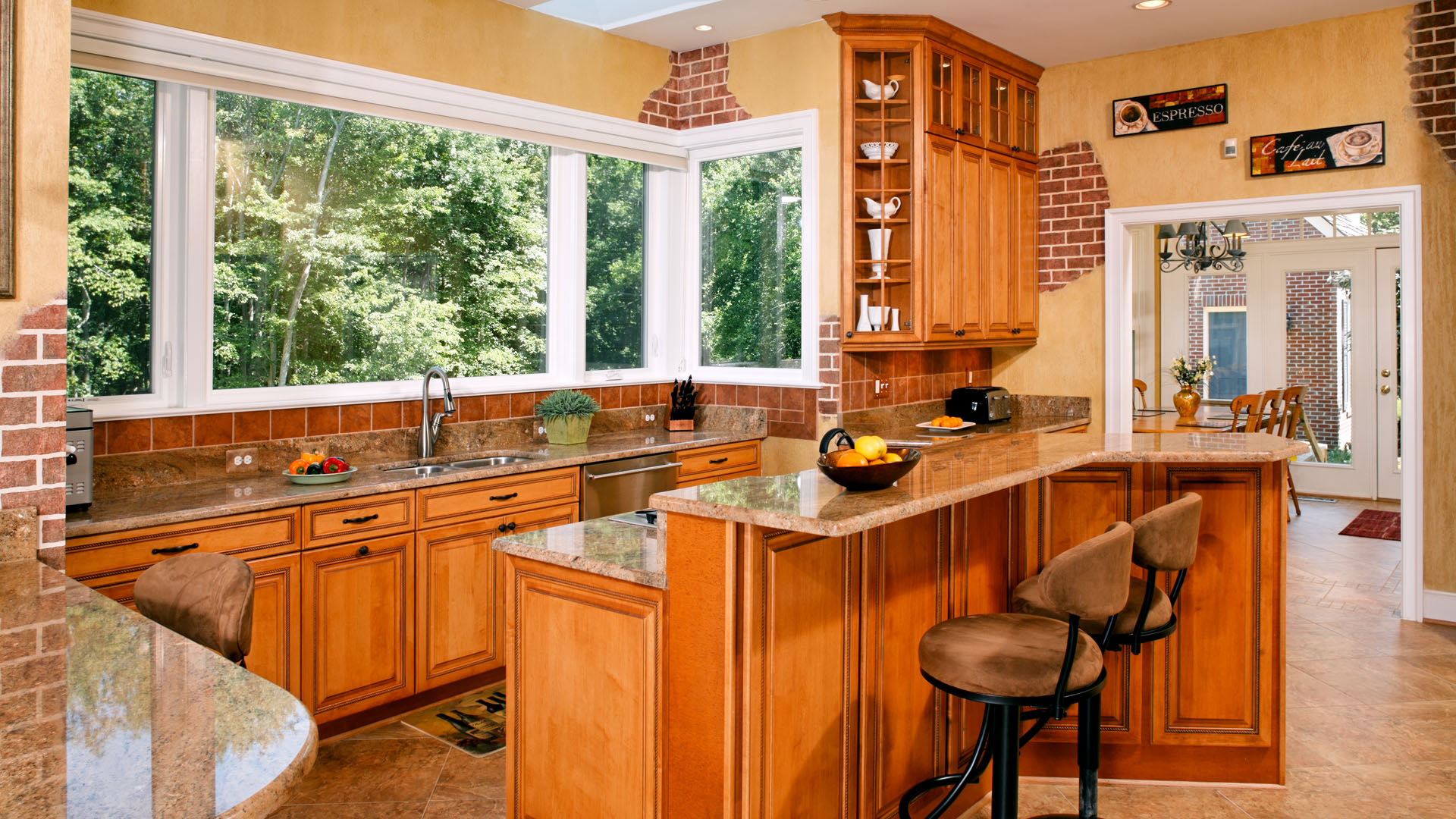
The kitchen had a lot of potential. The dining room doorway had to be relocated to allow some of taller elements placed against it. This made the sight clear of any blockage. Also a larger kitchen and double ovens can be placed there.
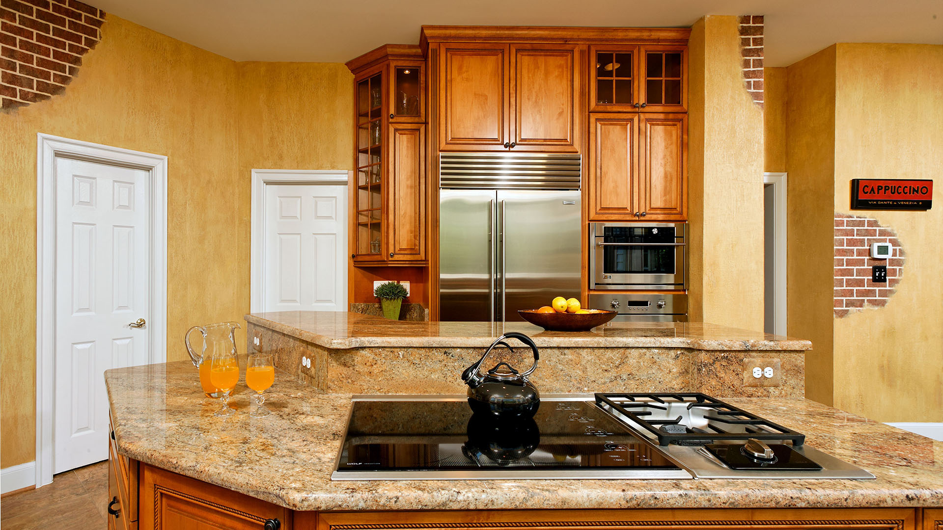
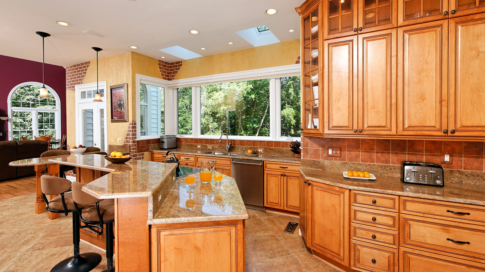
The opening between kitchen and sitting room has gotten wider by installed couple of support beams. Butler cabinetry took place of old fridge location.
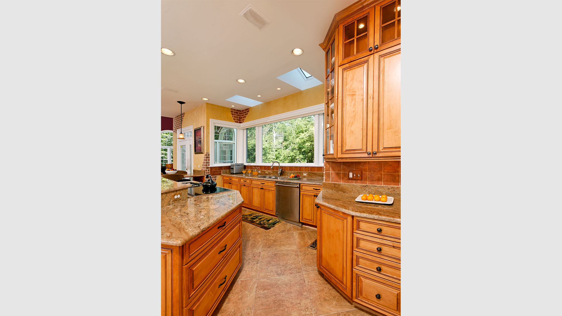
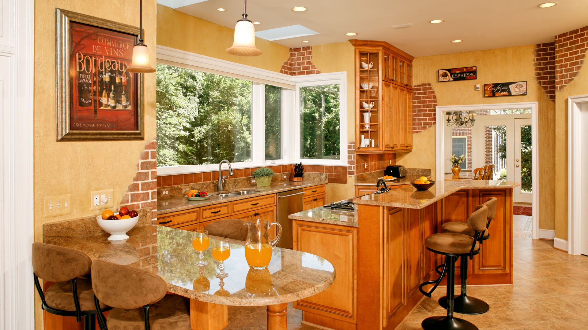
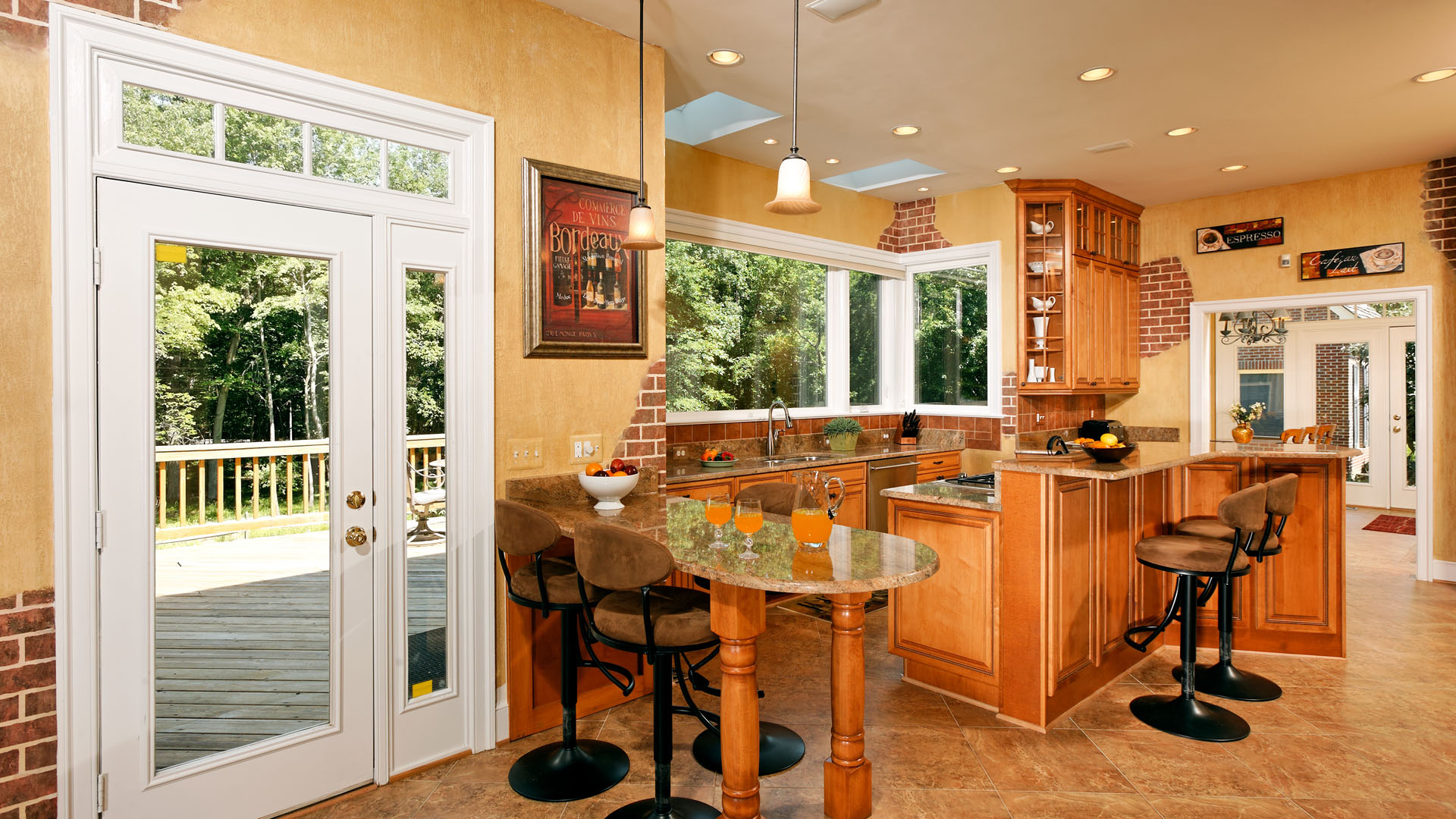
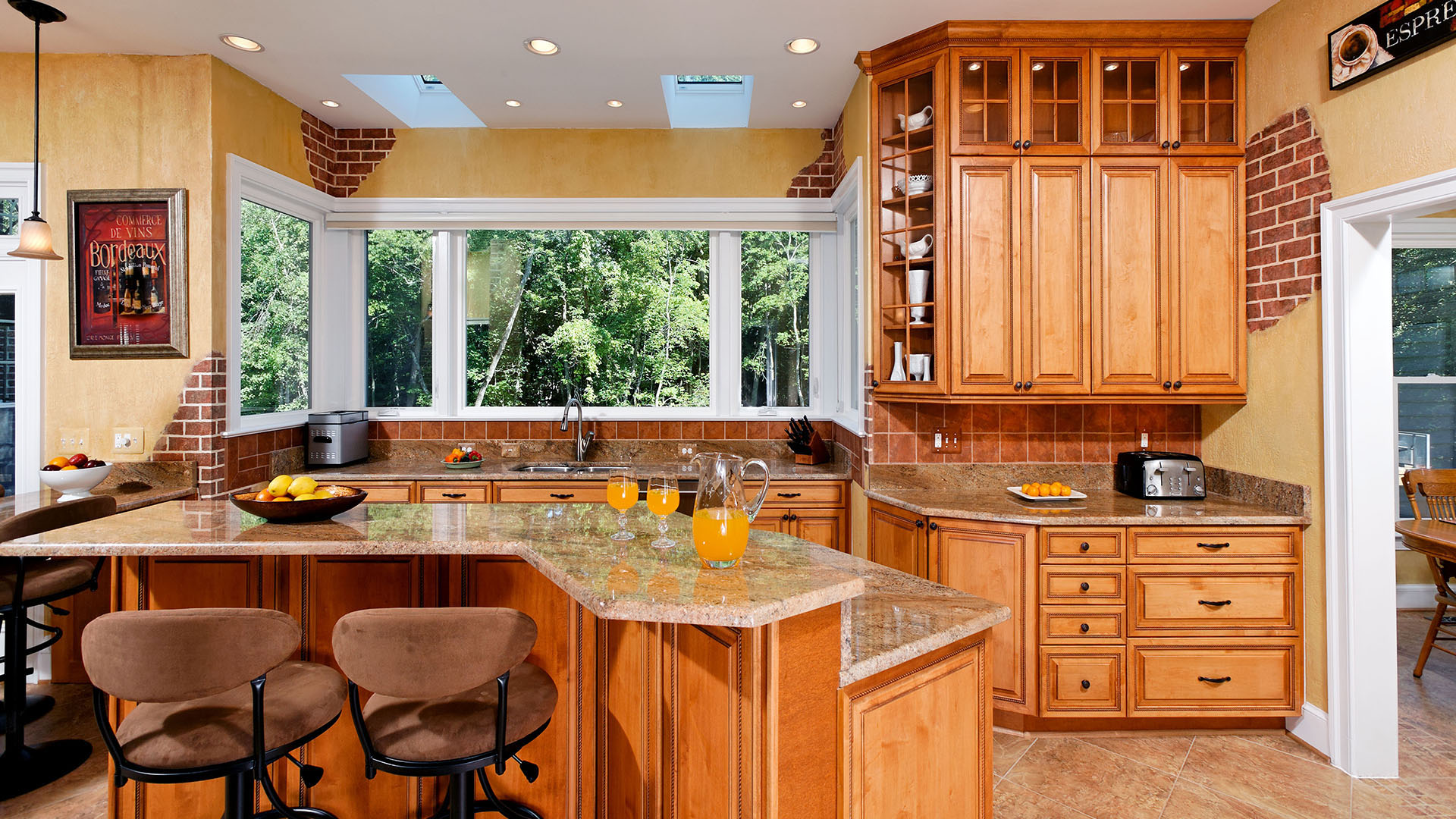
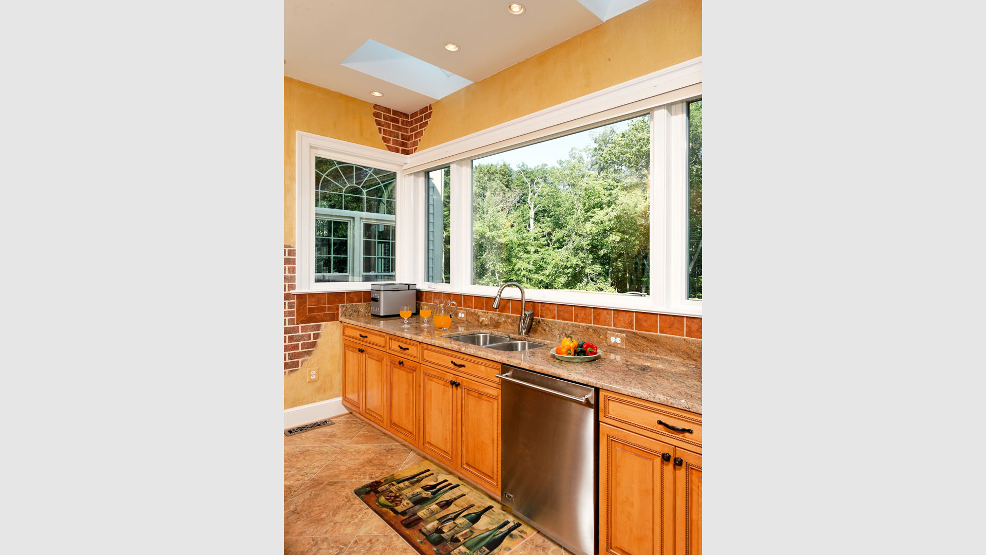
A new designed was put together which involved reframing the entire garden window with roof rafters and wall framing. Two new skylights taken over the old glass panel.
All bulkheads and its plumbing contains had to be taken out and relocated. We have taken advantage of the height in this kitchen and created stacked cabinetry for upper display cupboards.
The traffic pattern old the old kitchen was part of their main dislikes. That was taken out, and new larger cooking island with angular wings and seating space around it taken over the center of this kitchen.
An additional counter top built over columns offered space for kids to do homework or having a snack.
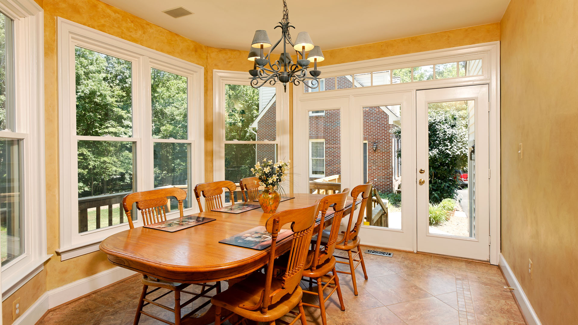
Entire kitchen and breakfast area now has a larger porcelain tile floor laid in a pattern to make the place even larger.
Marriage of faux painting and brick fascia have introduced some ragged look into this new lay-out
Honey colored maple cabinetry with a slight rubbed through cholocate glaze finish gave a classic but sophisticated look to this kitchen.
Owners are thrilled with the outcome of this remodeling and wanted to do more to their rest of home.

 before and after