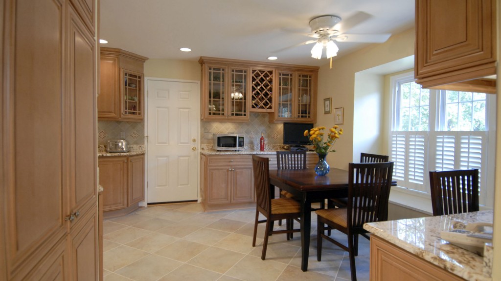
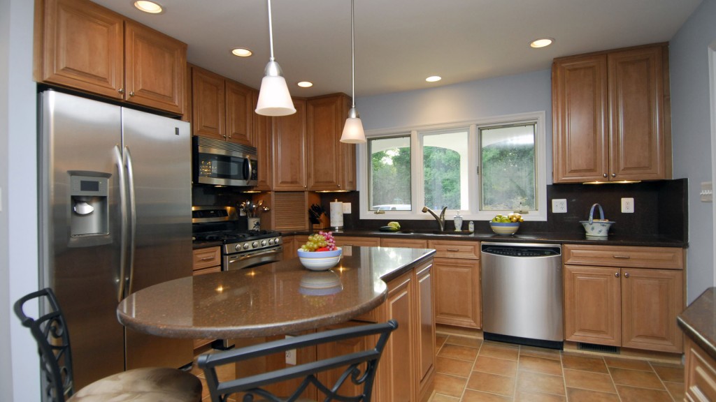
DSC

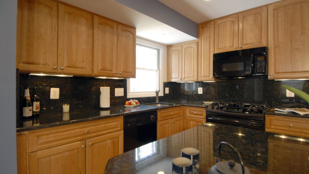
Kitchen 101 Gallery

In a tiny older home, this kitchen was open to the dining area, but was not a good use of storage space, and the owners wanted to open it up to their back yard with double doors, instead of having the one single door that was located in the middle of the kitchen, chopping up […]

Kitchen 101 Gallery Read More »

DSC

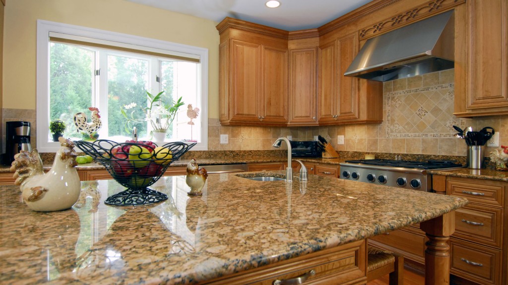
Kitchen 102 Gallery

This kitchen was remodeled in conjunction with the rest of the home’s baths, foyer, floors, plumbing, etc… basically the entire home’s interior. The kitchen was nearly large enough, but was not configured well as it was built around the laundry room, which took too much space from the kitchen. We moved the wall back (right

Kitchen 102 Gallery Read More »

DSC

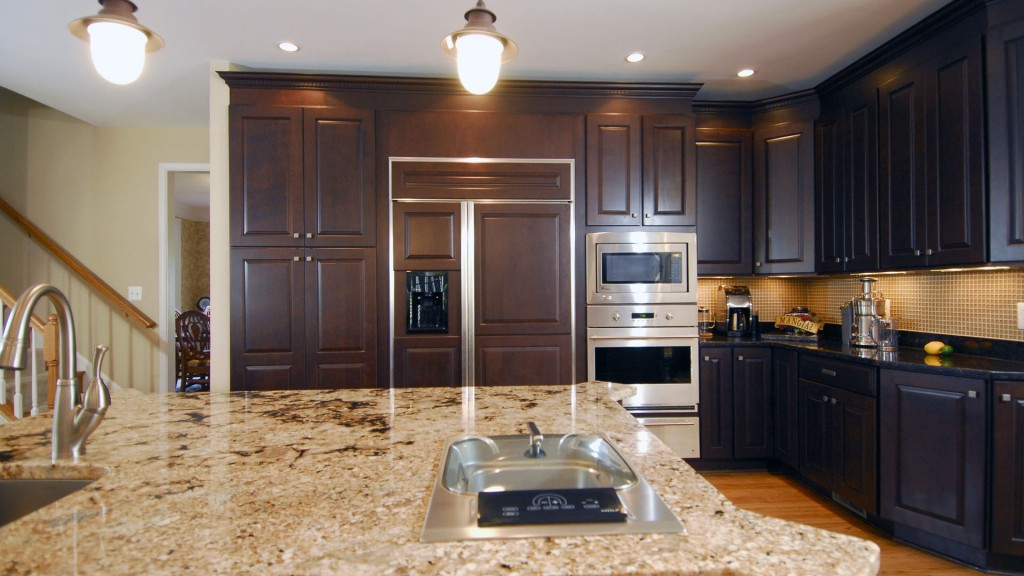
Kitchen 103 Gallery

This relatively recently built home had a large kitchen, but the homeowners wanted a more dramatic kitchen, and they wanted to better utilize the breakfast room space that they did not use. As well, they had a corner pantry that took up wall space that they wanted to incorporate into the kitchen and the laundry

Kitchen 103 Gallery Read More »

DSC

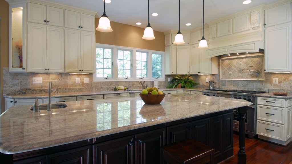
Kitchen 104 Gallery

All white builders grade kitchens are very common these days. This one had a good amount of space, but for a homemaker that loves to cook and bake, it was inadequate in space, as well as not functional. She wanted to have more space to bake, meaning a larger island, as well as space at

Kitchen 104 Gallery Read More »

DSC

Kitchen 105 Gallery

This kitchen in a two story contemporary home was cut off from the dining and living areas by a corner wall. The ceilings in the house are cathedral style, but that did not help make the kitchen feel any larger. We removed the corner walls in order to open it up, and replaced the one

Kitchen 105 Gallery Read More »

DSC

Kitchen 106 Gallery

This kitchen remodel was part of a whole house remodel of a very small home in Vienna. The original kitchen was a fraction of the size, and took up a small corner of this space. The doorway into the kitchen from the foyer was too small for more than one person, and made the kitchen

Kitchen 106 Gallery Read More »

DSC

Kitchen 107 Gallery

The remodel of this kitchen expanded its size dramatically and gave the homeowners more storage space for both the kitchen and the nearby family room, while at the same time improving the look and open feel of the space, and allowing in more natural light. We added decorative touches as well, to make it an

Kitchen 107 Gallery Read More »

DSC

Kitchen 109 Gallery

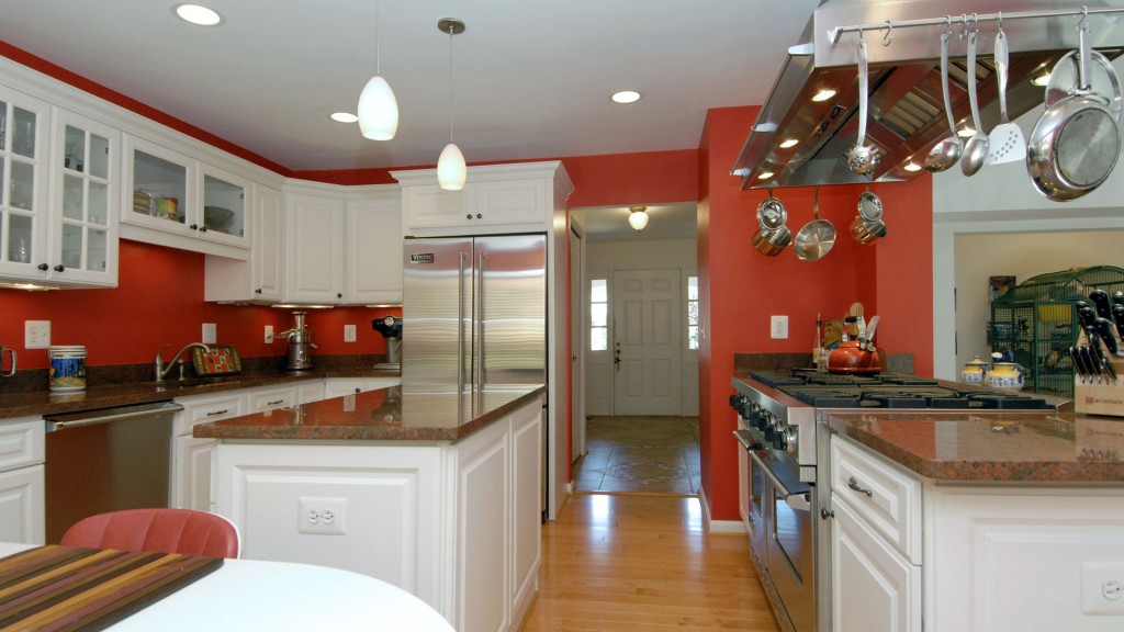
An artistic homeowner wanted to have a colorful kitchen with a touch of retro. She likes bright colors, and chose the red for the walls. She wanted a clean bright look to compliment the wall color, and she chose the white glazed maple cabinetry and stainless steel appliances to go with it. She wanted the

Kitchen 109 Gallery Read More »

DSC

Kitchen 110 Gallery

This 1980′s “L” shaped kitchen had plenty of space, but it was chopped up and had a bulkhead cutting it right in two, and soffits that limited the storage space in the cabinets. We remove the bulkhead and replaced the support with a beam embedded in the ceiling, to open up the entire room. We

Kitchen 110 Gallery Read More »

DSC

Kitchen 111 Gallery

In this older home, the kitchen was a small “U” shaped work space with cabinets hanging down and dividing up the room. The hallway to the laundry room behind the kitchen also had the pantry cabinet, so they had to walk around the peninsula to get to it. The hallway was also too narrow. We

Kitchen 111 Gallery Read More »

Scroll to Top