almquist

Bathroom 88 Gallery

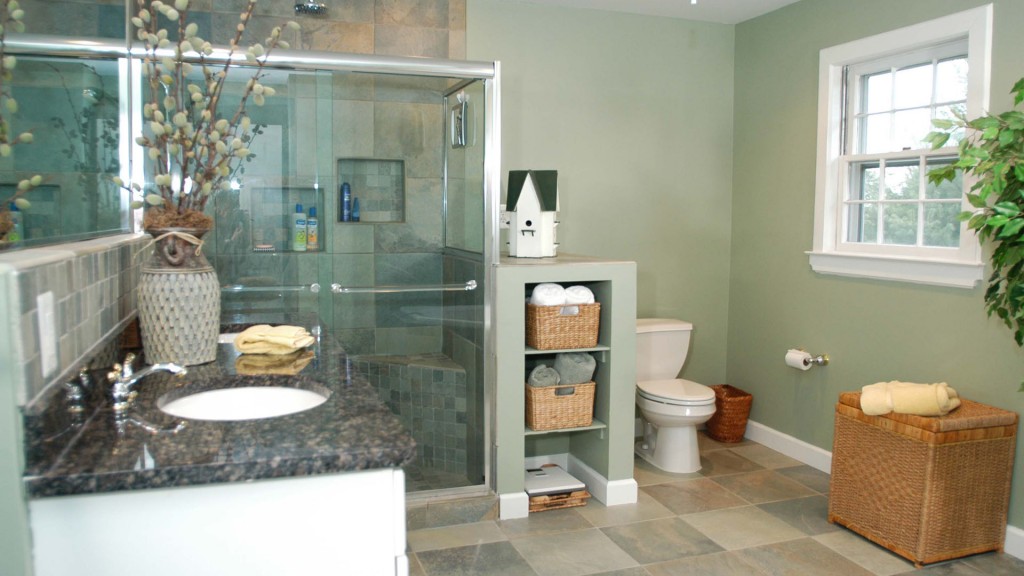
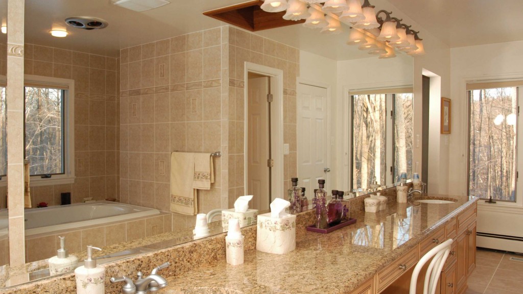
This master bath is now a spacious sanctuary of earthtone colors, playing off the color scheme of the master bedroom next door. Features such as hidden storage adjacent to the shower, a ceiling fan, shower niches, a large double undermount sink vanity with lots of storage, and a corner tub, give the homeowners plenty of […]

Bathroom 88 Gallery Read More »

DSC

Kitchen 117 Gallery

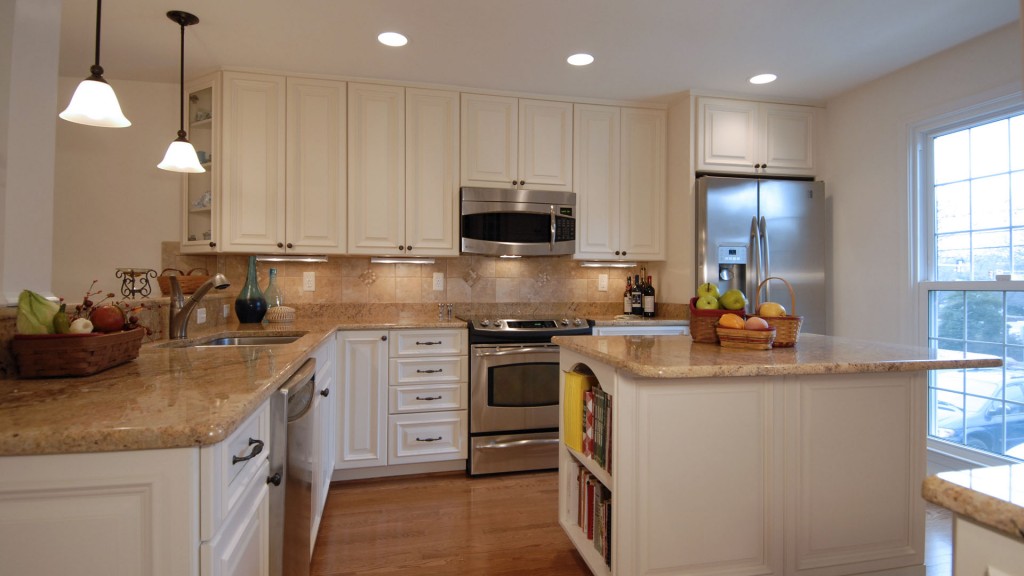
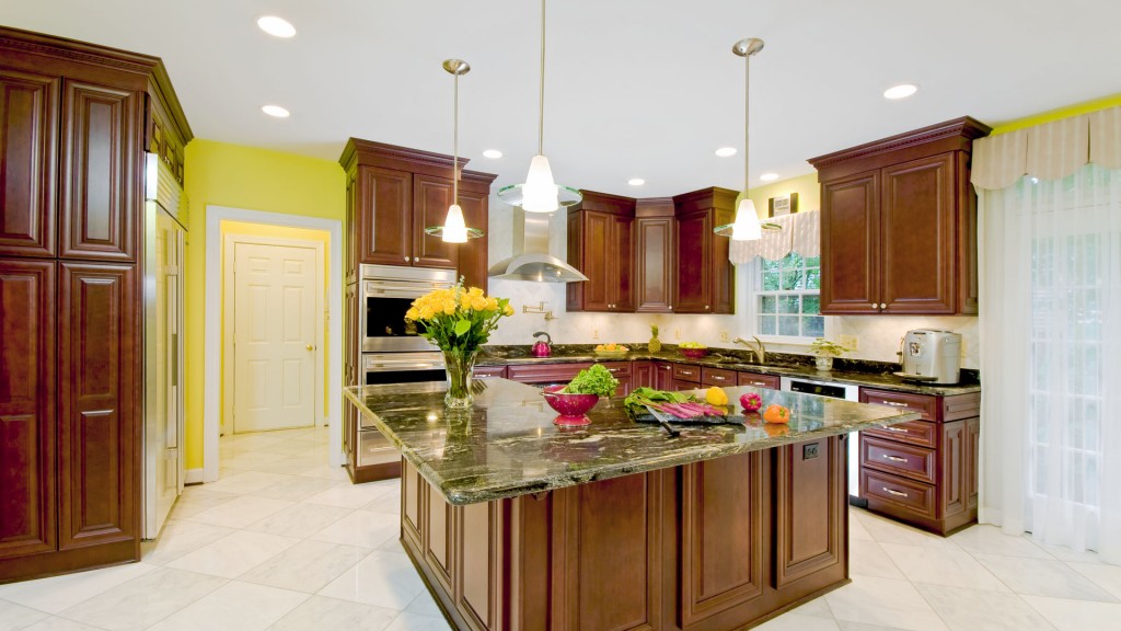
Old and dark, this kitchen was badly in need of an upgrade. The owners wanted to make it lighter, but they still wanted rich wood tones. They also wanted to have more space for storage, and to have an island that they could eat at. They did not like the peninsula because it impeded the

Kitchen 117 Gallery Read More »

costello

Bathroom 98 Gallery

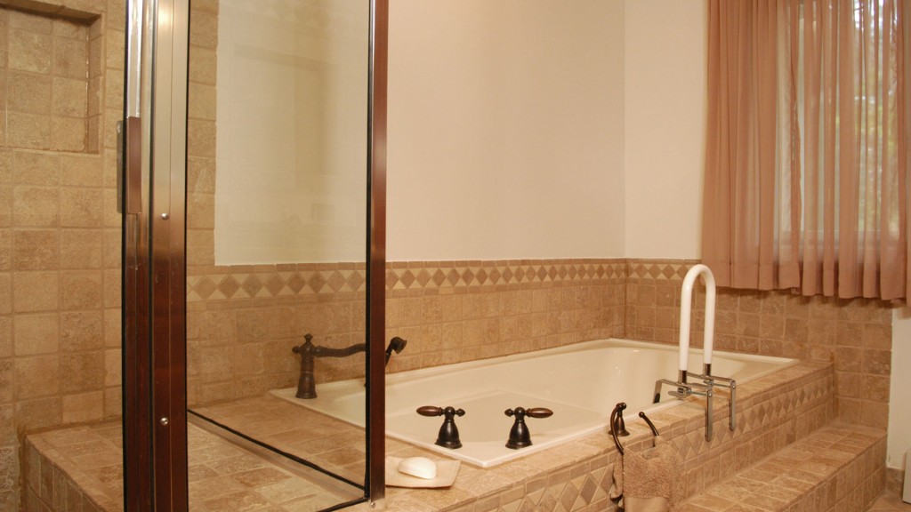
A new addition to this home now houses this luxurious bath, that is fully equipped with grab bars to assist the homeowners with accessibility now and into the future. We fulfilled their request for intricate tile designs and a pleasing neutral palette, additional storage space and easy cleaning. They also have dual sinks with granite

Bathroom 98 Gallery Read More »

DSC

Kitchen 118 Gallery

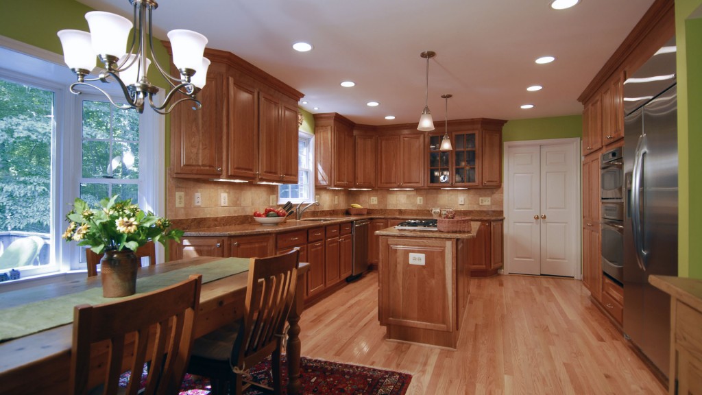
The homeowners wanted to update this large kitchen and have warm woods, but not dark cabinetry. They like bold colors and wanted the kitchen to be a focus of the family room next door. We removed the peninsula and created an open space with an island with a cooktop. The breakfast area is large and

Kitchen 118 Gallery Read More »

haley

Bathroom 108 Gallery

This small master bath was original to this 1960′s era home and needed to be enlarged and updated to accomodate the couple. To do this, we incorporated space from a small closet into the bath, moving and resetting the wall and door entering the bath, to be more conveniently located within the room. We then

Bathroom 108 Gallery Read More »

DSC

Kitchen 119 Gallery

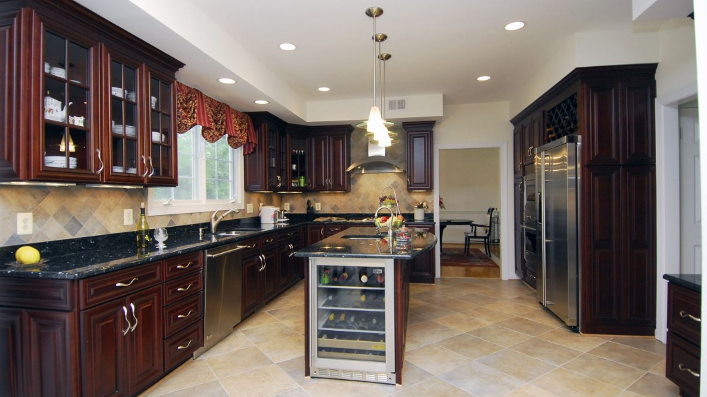
This kitchen has an oriental flair. The deep tones of the cabinets with just a tinge of red in the finish contrast with the light tones of the tumbled limestone tile backsplash so it does not get too dark. There are plenty of glass front cabinets to help break up the expanse of solid cabinet

Kitchen 119 Gallery Read More »

hollinger

Bathroom 109 Gallery

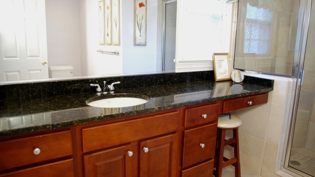
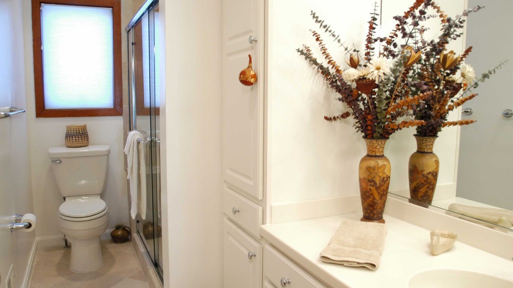
This long narrow bath was updated with light tones to increase the perceived size, the cabinetry was built right up to the ceiling to utilize the space the most efficiently, and the upgraded shower includes a built-in bench, storage nooks and the latest style of shower head and body sprays. The tile used throughout the bath is

Bathroom 109 Gallery Read More »

DSC

Kitchen 120 Gallery

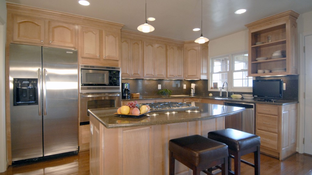
Our remodel of this builder’s kitchen upgraded it significantly. We installed full height upper cabinets and stainless steel appliances, as well as a large island with a generous curved top, and a gas cooktop with a downdraft ventilation system. The contrasting dark granite is a full backsplash giving it a rich feeling. We built in

Kitchen 120 Gallery Read More »

katz

Bathroom 112 Gallery

This spacious double master bath has all the luxury of space and convenience in a narrow space that feels much larger because of its configuration. The windows at either end and over the spa tub give it lots of natural light in this private setting, and the view from end to end extends outside. The

Bathroom 112 Gallery Read More »

DSC

Kitchen 175 Gallery

Kitchen Remodeling [PROBLEM]: Owner of this Clifton (VA) production house were seeking a substantial upgrade in both the functionality and aesthetics of the existing 14 x 22 kitchen as follows: Dropped ceiling and narrow breakfast area make a restricted footprint seem even smaller; Ceiling-flush bulkheading and the lack of useful cabinet storage causes on-going clutter,

Kitchen 175 Gallery Read More »

Scroll to Top