When you are the hub for extended family
Skillful interior makeover converts dated rooms into elegant gathering place
By John Byrd Special to the Fairfax County Times
What a relief to be living in a “holiday-tested” house as the New Year unfolds.
Such are the reflections of Gregory Brill causally critiquing the kitchen-centric floorplan recently introduced into his family’s busy lifestyle.
What can this baby do?
A sit-down dinner for forty or more, family gatherings at Thanksgiving, Christmas open house parties, birthdays, anniversaries.
“We’re the hub for our extended family,” Brill explains. “So I appreciate a plan that makes it easier to prepare meals and spend time with guests. The visual connection really adds to the festivities.”
A food preparation island, well-organized workspaces and several strategically located “built-ins” facilitate multitasking. Yet the kitchen “finish work” is so artfully integrated that the entire first-floor functions as an upscale entertainment suite. “The effect”, Brill acknowledges, is a far cry from the compartmentalized warren of small rooms that dominated the home he had purchased in late 2009.
Certainly, the original house– a circa 1980s center hall Colonial on a tree-shaded lot in Burke– had potential for a young family that included preschoolers. There was the large backyard; the comfortable, well-located neighborhood.
“But when I took a critical look at the first level floor plan,” Brill recalls, “I knew entertaining was going to be a challenge.”
For starters, there was the problem of the tiny (8-by-14 foot) galley kitchen situated in the rear and sandwiched between a small dining room and an equally constrained family room.
With a front-facing formal living room, Brill pictured entertaining as one endless trudge from the stove to the front parlor and back.
Complicating matters, several interior walls didn’t so much confer privacy as inhibit circulation. A knee-high railing between the dining room and living room added nothing as a zoning solution.
And beyond this: Brill recoiled at the absence of sightlines, observing that “the whole purpose of having a party is for people to see each other.”

PHOTO BY GREG HADLEY
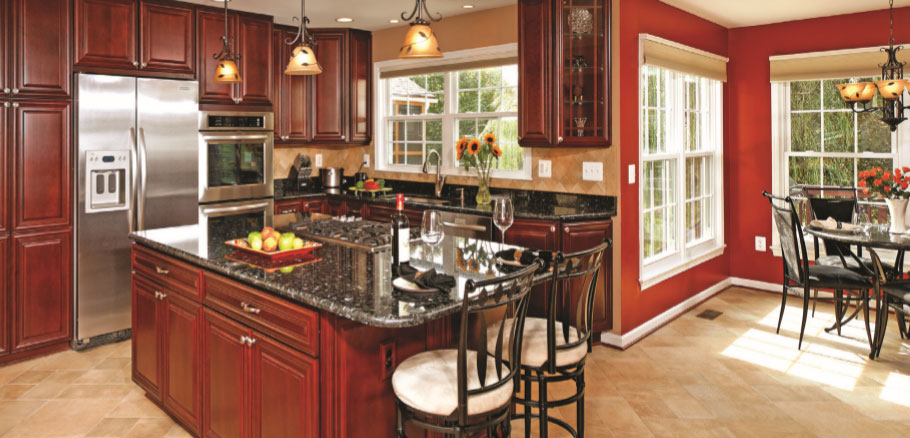
A “kitchen-centric” floorplan that replaces the former 8-by-14-foot galley kitchen in a 30- year- old home has dramatically improved the usefulness of first-level rooms for holiday entertaining. The homeowners say they can now accommodate sit-down dinners for forty or more. The plan makes it easier to prepare meals while simultaneously attending to guests

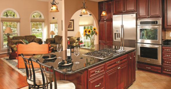
As an interior design solution, remodeler Sonny Nazemian proposed decorative archways that conceal supports, keep sightlines clear and add dramatic midroom accents. Hardwood flooring, color variances and other formal elements help to define primary gathering zones in an otherwise open plan that features easy circulation
What to do?
“We interviewed several remodelers,” Brill recounts. “But Sonny Nazemian at Michael Nash Design Build offered plausible solutions the first time we walked through the house together. When I stopped by his office a few days later, he presented me with detailed conceptual drawings. His ideas have really worked.”
Reconfiguration and Upgrade Since Brill was especially interested in a plan that would facilitate first-level socializing, Nazemian– certified as both a remodeler and an interior designer– proposed a room reconfiguration that places a gourmet kitchen squarely into the home’s mainstream.
To augment formal dining, the family room was “re-purposed” into the new dining room complete with fireplace. Square footage formerly allocated to the old dining room was, likewise, co-opted into the footprint of a substantially enlarged kitchen suite—which now boasts a sunny breakfast nook.
L-shaped granite-surfaced counters along the south and west elevations of the old dining room now define two legs of the cook’s new work triangle. The third component– a food preparation island– includes a range oven, custom-designed storage and a two-stool dining counter.
Satisfying the homeowner’s passion for enhanced visual linkage was a separate matter.
To open up sightlines, Nazemian removed a load-bearing wall between the family room from the kitchen, shifting upperlevel support to micro-laminate beams resting on vertical shafts. A wall between the old kitchen and dining room was also deleted. As an interior design solution, Nazemian proposed decorative archways that conceal supports, keep sightlines clear and add dramatic midroom accents.
A butler’s pantry and china cabinet abutting the new dining room serve dual roles. The elevation facing into the kitchen features a sink, a microwave, a warming oven and a generouslysized granite serving-surface. In the dining room, glass-facing cabinetry provides easy access to china and stemware.
“I’ve found that a successful open plan demands cohesive interior design,” Nazemian observes. “The point is to create a greater whole.”
On this score: the design team replaced builder-grade linoleum flooring with a diagonal pattern of soft beige porcelain tiles. Emerald pearl granite surfaces were deployed for the food-preparation island, butler’s pantry and countertops.
Cherrywood cabinet facings present a crisply refined finish. Suspended above work and serving stations, Tuscan-style pendant lights offer a softly amber illumination.
As always, inspired color combinations both particularize and unify. Earthy reds highlighting the breakfast room contrast with the softer pastels of porcelain backsplashes, drawing out the rich overtones of the cabinet and counter surfaces.
The white ceiling neutralizes the bolder statements—but also invites the eye to explore spatial expanses that unfold in all directions.
Other details demonstrate the surprising versatility of a remodeling service that includes a wellendowed showroom backed with accommodating suppliers.
A unique slab of granite above the fireplace in the dining room, for instance, caught the homeowner’s attention as a potential objet d’arte. Yet the surprising turn was that Nazemian’s fabricator allowed a hand-draw jagged outline for the slab’s topmost edge, shaping the piece to personal preference.
“The company was really committed to satisfying our aesthetic requirements,” Brill observes. “The attention to detail is impressive.”
